Monday 30 March 2015

Best Edit

Before and After

This is my best edit for shoot 2, it is of a male model who has pushed his face against a scanner while its being scanned to create the theme of flaws I am trying to show to contrast against perfection. The model has been made to look larger then he actually is due to glass, ugly and discoloured and I like this image as I feel it really shows my artist influence of Jenny Saville. I edited this image by increasing the contrast and then playing around with curves which has made the models hair look very thin and like straw compared to the original image where it looks soft and thick. It has also made the lips and face look a lot more red, in pain and blotchy which has made his lips look more plump too. You can also see blemishes and imperfections more on the face. The last thing I did to the image was crop it slightly from the left hand side so that you can't see the transparent paper underneath. 

For my next shoot I plan to further my experimentation by using glass again but from somewhere different which will be the glass from my bedroom window and my classroom door in order to squash my models face up against to develop my work. This time I will be able to see how the model is morphing their face and I can give them guidance as to how I want it too look whereas I couldn't in the scanner.

Sunday 29 March 2015

Edits

Before                                                                                               After
In this image I played around with the tool hue and satiation tools in order to make the image look more 'cold'. I increased the hue by 36 and the saturation by 20 which helped make the image look more 'cold' and has also made the models hair green which could be considered a flaw. It has also made the skin appear more white and in distress from being squashed. What I like in this image is that it looks as if the model is underwater, which I think the editing has helped achieve this effect but also the transparent paper we put underneath the models face. 

In this edit I decreased the brightness to make the background look darker, then I increased the contrast to highlight the face more as it added more colour to the face. Compared to the original image it doesn't look I have decreased the brightness and increased the contrast and this is due to me then experimenting with the blacks, greys and whites using levels and from doing so I have managed to edit it so that you can see all the dirty fingerprint marks on the scanner from other people using it which has made the image flawed. In both images the model is using here hands to help aid in distorting the face. 

Thursday 26 March 2015

Shoot 2


Shoot 2 went well and was fun and interesting to do as part of my experimentation. In this shoot I took different members from my class and asked them to push up their faces against the glass on the scanner to use an object completely different to try to morph their faces. I have used my artist influence of Jenny Saville and you can see this in my images trying to make the models look fatter and ugly even though this is not what they actually look like and they are against glass like in some of Saville's paintings however I have created the images digitally. What went well is that I feel I really captured the influence of my artist really well and that the images worked out well as I wasn't too sure how they would turn out in the scanner. I was trying to create flaws within the photos as the models cheeks and noses were squished so I could compare them against my photos where I am trying to create perfection which is how they link into my shoot before. What didn't go so well in the shoot is that in scan 5 the models hair got in the way of the rest of the image so you cant really see where here face has been distorted, also the transparent paper underneath the models faces moved when the models were on the scanner being scanned which has created the colourful lines in scan 2 and scan 4 however this can follow along the themes of flaws and perfection as it has flawed the image by being there. This then gave me the idea of what things I could do post-production wise in order to flaw a photograph, some ideas I had included burning an image, sandpapering an image and seeing what effect it had, following the artist Maurizio Anzeri and sewing into an image, smudging the images in Photoshop and using glitch art.

Monday 23 March 2015

Photo Analysis

Title: Unkown
Artist: Jenny Saville
Date: 1995/1996
Oil on canvas
Title: Fulcrum
Artist: Jenny Saville
Date: 1999
Oil on canvas
I like these images as the nudes are very exaggerated, I think the images show how women
perceive their bodies as they feel they are a lot bigger than they actually are but once again it has been exaggerated but Saville is trying to make expectation of what is perfect more appropriate compared to a skinny women. The image on the right is actually a painting of what I can see of 3 women squashed up against and laying on each other. The image on the right is a painting where the models face has been pushed up against glass, how the face is deformed and flawed as the models face would not look like this usually but due to the glass it has been altered. There are many different tones of colours in the paintings that have been layered and are overlapping with the marks of paintbrushes which have been dragged and twisted around in different motions on the canvas but the tones are bland and pastel coloured based. The actual paintings of the skin its-self is quite violent, harsh and bruised.

Title: Plan
Artist: Jenny Saville
Date: 1993
Oil on canvas
This painting is a nude portrait of Saville herself and has been intentionally made to look large, even with large breasts which have to be held up in order to see the rest of the body. The lines drawn on her body remind me of the marks surgeons make on you before you are about to have liposuction done or the targets on during archery. It brings out the idea that the the skin needs to be cut away because model is flawed where she is fat and not perfect and skinnier, like a males or the media's typical fantasy of the perfect body, which shows the artist concerns on the matter. I also can see a sense of vulnerability as she is naked and using her arm to cover herself however in contrast to this at the same time you can see the strength and power in the painting being able to bare all. 


Friday 20 March 2015

Jenny Saville

For my second artist influence I wanted to find someone who would help me to take images where I am manipulating the model and setting them up to intentionally make them flawed before taking any photos. I have decided to use Jenny Saville as my second influence as her work really stood out to me, it is very striking to look at and makes you take a few steps back. Im not too sure what to make of her images as they are very intense but they do make you think and are interesting to look at. It looks obscene but in reality all her work is very beautiful, they show women in an overweight disturbed form and hold a gritty realism of the human body showing its perfections and imperfections. She is a 44 year old contemporary British painter who attended a BA course at the Glasgow School of Art, where most of her work is doing using oil. She is best known for her large scale, semi abstract, figurative paintings of nude women and transgender people with blemishes and disfigured faces. She is inspired by Pablo Picasso from the way he makes the figures feel they are actually there and in her paintings she tries to use painting realism creating photo-realistic paintings. Jenny likes to paint flesh as she says "it's only natural and it's beautiful to paint" and she sometimes includes her own boy in her images making sure that in her work the mass and physical bulk of the bodies fill the whole canvas looking barely contained by it. Her work is strongly pigmented and she creates a lot of mark making so your eyes moves around the flesh. In The Telegraph Jenny Saville says "I like the down and dirty side of things. I don't like things to be too polished. We've got fashion magazines for that" which suggests to me she would be a good contrast for my work compared to my other artist who uses tools to polish her images e.g. softening the face as Saville prefers to work naturally not trying to make every detail perfect.

How am I going to use Jenny Saville as an influence?
I am going to use Jenny Saville as an influence in my work to expand on the experimentation in my work but I will be focusing on creating flaws in the model by using props. Some images I looked at that have inspired me were Saville's paintings of larger nude women pushed up against glass. For my third shoot I plan too use members of my glass and getting them to push and mush up their faces against a glass scanner, to create a flaw as their faces aren't typically "perfection".

Wednesday 11 March 2015

Best Edit

Before and After: This is my best edit for shoot 1, it is of a female model who I am taking a simple portrait of which is how my influence of Annie Leibovitz is being shown. I have presented the image before I cropped it as well as it is easier to
tell the big differences in the edited image from the original image between these two images rather than looking at the original and the cropped image. This best edit follows on from the step by step edits below. To get this final edit completely airbrushed it and I edited it by doing all the steps I outlined below, then I used the clone stamp tool in order to get rid of all the stray hairs and then I finally cropped the from the top and the sides slightly which as made the model look taller. I was trying to perfect the image and airbrush it like you would in beauty magazines.

For my next shoot I plan to leave the theme of perfection and my artist Annie Leibovitz and come back to her later. I plan to follow the theme of flaws and get members of my class to push their faces up against the scanner while it scans in order to flaw their facial features.

Tuesday 10 March 2015

Edits

You should look at these images in a zig zag pattern from left to right or if you click on the first image to make it larger you can view them as a slideshow. The image on my left is the original image and the images thereafter are a step by step presentation of how I edited the original image in order to get to my final/best edit. In the first edit I made the models teeth whiter and I did this through the same process as in my initial shots by using the lasso tool to select the area I wanted, then selecting yellows and decreasing the saturation to -100 to remove the yellow from the teeth leaving them whiter and using the lightness slider to brighten the teeth. However when I did this it brightened the area around them so I filled the layer mask with black and used the brush tool and painted over the teeth with white to bring the whitening and brightening back. I also set the opacity of the layer to 75% so the teeth looked more of a natural white rather than being over brightened and whitened. In the second edit I have made
                                            it look as if the model is wearing lipstick as i
added more colour too them. I did this by using the lasso tool to select the area of the lips I wanted and then I dragged the hue slider along till I got a nice pink shade I wanted that wasn't too overdone. In the third edit I have used the spot healing brush tool in order to remove all the blemishes, freckles and spots on the model and then I neatened up her eyebrows so they weren't as bushy. I did this by using the liquify tool and then using the forward warp tool with a brush size of 40, brush density of 20 and a
brush pressure of 30 around the eyebrows to make them look longer and thinner. The movements were up-down at the top and down-up at the bottom. In my fourth edit I was focusing on making the models nose smaller and thinner so I used the liquify tool and used the forward warp tool again using a smaller brush size for the top of the nose and a larger brush size for the bottom, using movements going towards the nose. Then I used the pucker tool to make the smile lines look smaller and better. In this edit I also used the liquify tool and forward warp tool again in order to make the models face, head and body thinner and smaller using a large brush size of 300. 

Friday 6 March 2015

Shoot 1


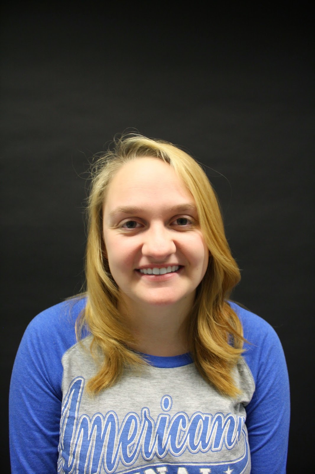
This is my first attempt at shooting some portraiture images in the studio using a black backdrop and natural lighting from the sun, for a beginning shoot, shoot one went okay but could be improved upon. I have used the artist influence of Annie Leibovitz in my images and have done this by taking portrait images. Annie's images are very soft and subtle but still show a selection of emotions in her work. I tried to experiment and create the same effect by using a member of my class and trying to capture their different emotions of serious and happy and smiling. What went well in the shoot is by using a plain dark backdrop in my images it has made the models face stand out more in the image. Towards the end of the shoot in image 8841 the model was gaining more confidence and shows a lot of happiness in the image. Also in images 8839 and 8840 the light is coming from the top left hand corner which I think highlights the models face nicely. What didn't go so well is that some of the images have come out overexposed such as image 8819, a couple are blurry like image 8809 and I do not feel I have captured different facial expressions very well which may be due to my model not feeling as confident at the beginning of the shoot. If I was to do this shoot again I would improve by using female and male models to add variety to my images, I think that by using a male model I can capture a lot of depth in his facial expressions if I ask the model to be serious and keep using the female model to display a happy facial expression and other emotions such as laughter or sadness. I could also experiment by trying out a white backdrop instead of a black backdrop and seeing what difference this makes and getting the model to do different poses and sit or stand in different positions. 

Tuesday 3 March 2015

Portraiture Tips

I did some research online in order to gather some portraiture tips that would be useful before I start shooting portraiture photography. Here were the tips I found which I am going to try and follow in my own portraiture work:
  • You need to know how to pose your subjects for portrait photography properly to shoot flattering images
  • Your subject should always be relaxed to create a improved portrait
  • Do not be afraid of movement
  • For close up portraits focus on the eyes
  • Softer images are better for portrait photography
  • Experiment with subject expressions
  • Fill the frame
  • Think about your composition
  • Experiment with lighting
  • A wider aperture (small f number) is best for portraits which gives a shallow depth of field
  • Use a tripod to reduce camera shake which could cause blur
  • If you have one, use a nifty 50 lens