For unit 4 the theme was flaws, perfection, ideals and compromises which I decided to focus on the themes of flaws and perfection. I have enjoyed doing this project, I think that my work has met my intention, the criteria of the theme and explored into flaws and perfection. I have shown the theme of perfection through the use of editing portraiture images where I am getting rid of what society and beauty magazines consider to be imperfections on the skin and airbrushing the image to make create perfection. I have shown the theme of flaws by doing the opposite and using objects and materials pre-production and editing post-production in order to morph and distort the models or the images to create flaws in the overall image.
The part of the project I found most interesting was editing the images to create different tones and effects to make them catch your eye more or look more flattering. I had the most fun editing shoot 1 because it was really interesting to see the transformation from the first image which was flawed to the final image were I am trying to make the model look more perfect by whitening her teeth, getting rid of blemishes, making the nose, face and body thinner etc and I think that my editing technique was very successful on this shoot. I feel that I have developed my skills with the hue/saturation tool and learnt some new techniques on Photoshop mainly from editing shoot one as I have learnt how to use liquify and forward warp tool. I have also learnt about creating the right amount of tonal balance between the black, white and grey tones and what effect cropping has on images. What I feel didn't work with my editing technique is that I ended up doing mostly the same kind editing on every image with the flawed shoots as I was always changing the image to black and white or playing around with the brightness, levels, contrast and saturation tools however at the same time I do not feel I could have done any more or different editing with these photos with what I was trying to achieve.
The 2 photographers I research and have been influenced by throughout this project were Annie Leibovitz and Jenny Saville. You can see Annie Leibovitz influence in my work through the use of taking portraiture images in the studio and editing some of them so that they are in black and white in order to help follow the theme of perfection. You can see the Jenny Saville's influence in my work where I am manipulating the model and setting them up to intentionally make them flawed before taking any photos in order to help follow the theme of flaws. For example, i my images the models faces are being deformed as they are squashed up against the wall and they look very similar to Saville's paintings of people pushed against glass.
I think that the most successful parts of this project are my portfolio, my final prints and my editing. My portfolio presents a very nice chronological, simple and effective overview of my work that is set out very clearly and shows of my work nicely. My final prints I think are really good examples to support my theme title and the way I am going to present them are a strong and interesting way of doing so which I believe will work well when displayed and will effectively incorporate all my artist influences. Finally with my editing I have worked very hard with it to create a variety of different effects and produce very strong edits.
In this project I did encounter a few problems and I feel the least successful part of this project was my photographing technique as I have never really done portraiture before so some of the studio shoots weren't as good as they could have been so I need to widen my skills at portraiture and get more comfortable at telling your model what to do and what positions you want them in. Another weakness actually getting around to developing my ideas and doing some more experimentation such as using different cameras and lenses or using the photography light box instead of relying on the natural light from the sun. From this I learnt more about myself knowing that in the future I need to open up my ideas more and not be afraid of trying something new and different even if it doesn't work out in order to test out new ideas and see what does and doesn't work so well. However I am happy with myself as I did get out of my comfort zone and experiment with portraiture which I had not done yet. I do not feel this that has effected my final prints due to that I have edited the images well so they look much more improved from the original images.
If I was able to complete this project again the things I would do differently are trying out different cameras and lenses and using the light box to see what effect they have and expanding and exploring my ideas further not being afraid to do more experimentation. I would also do another shoot on my artist Annie Leibovitz following on from shoot 1 and do another portraiture shoot but trying to make it better than the first. My final pieces relate to my research as they are showing the theme of flaws and perfection in a way that you can contrast and compare them. Overall I think the project went well and I feel I have reached my aim but there are things I could have done to expand and look deeper into it.
Thursday, 30 April 2015
Monday, 27 April 2015
Final Piece
For my final piece I have decided I am going to go with idea 2 and present it by printing 2 images A4 size mounted onto foam board. One image showing perfection and one photo showing a flawed image to contrast eachother. These are the images I am going to include:
 I have chosen these images as my final piece because I think these final prints are really good examples to support my theme title as they show flaws and perfection and I think the way I am going to present them are a strong and interesting way of doing so which I believe will work well when displayed and they will nicely compare and contrast each other. They also both effectively incorporate both of my artist influences.

Friday, 24 April 2015
Final Piece Ideas
For my final piece I have had a few different ideas on how to present my images. These include:
1) Creating a video, by choosing around 10 images and presenting them as a slide show on a projector.
2) Printing 2 images A4 size mounted onto foam board. One image showing an image of perfection and one photo showing a flawed image in order to create a contrast and make the audience think.
1) Creating a video, by choosing around 10 images and presenting them as a slide show on a projector.
2) Printing 2 images A4 size mounted onto foam board. One image showing an image of perfection and one photo showing a flawed image in order to create a contrast and make the audience think.
3) Choosing a series a photos and presenting them in a handmade photo book. Each double page will have one image of perfection and one image which is flawed to compare and contrast them. On top of each image there will also be words at the top of the page for each image relating to the topic.
Saturday, 18 April 2015
Experimentation - Glitch Art

 Back during shoot 2 I has the idea of things I could do post-production wise in order to flaw a photograph, one of the ideas I came up with was creating glitch art after looking at Andy Denzler's work. I decided I would try it myself and these are the 2 images I came out with. In order to make these edits I opened up the images in an application called TextEdit and I then destroyed the code by deleting parts of the code, adding new and random text and copying lines from the code and posting it somewhere else. It did take a lot of time in order to only get 3 or 4 lines so I decided to do 2 edits and then leave it as part of a quick experimentation which still shows the theme of flaws.
Tuesday, 14 April 2015
Best Edit

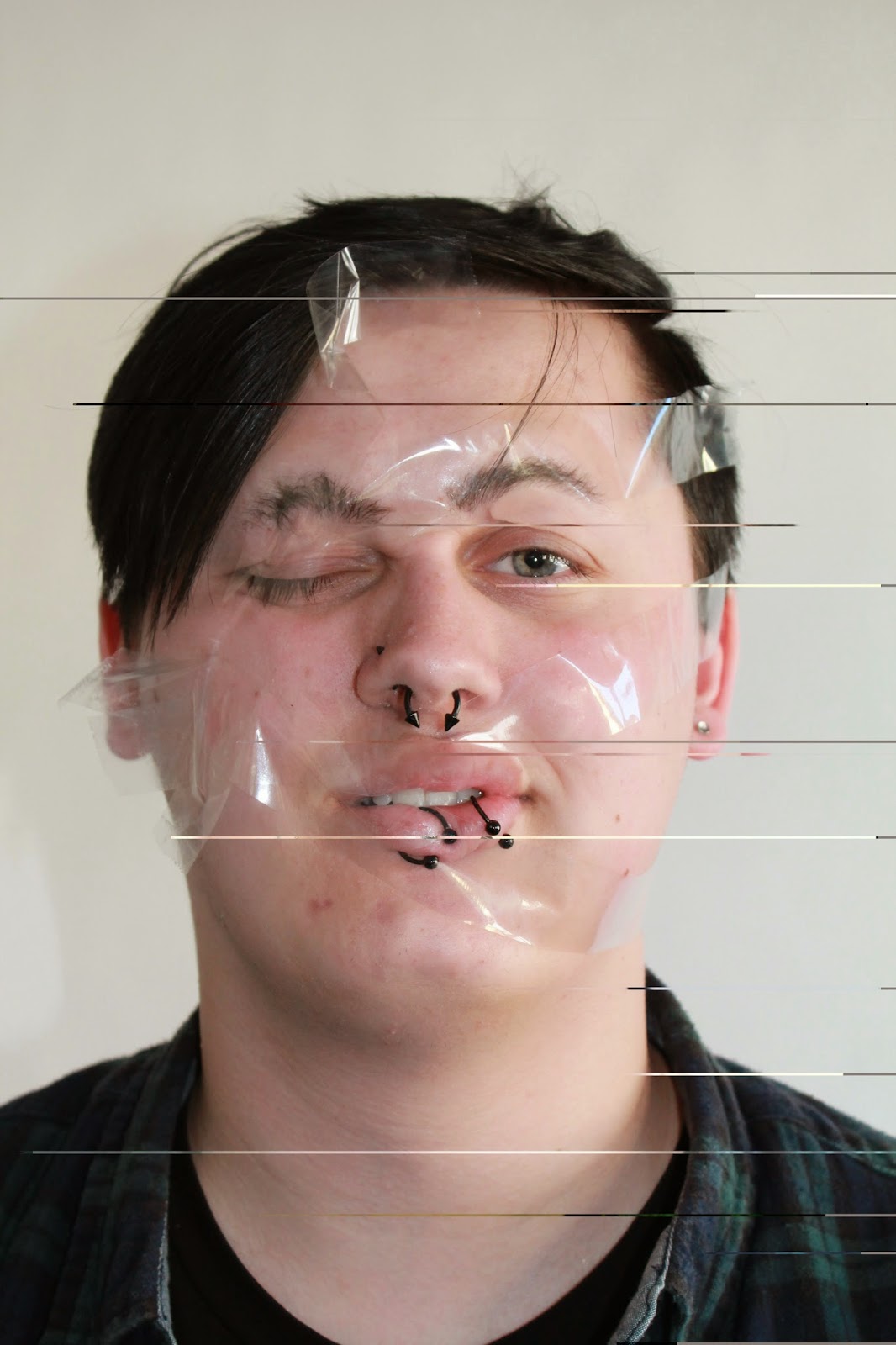
This is my best edit for shoot 4, it is of 2 male models whose faces are being morphed due to the cello tape wrapped around them altering their facial features in order to make them flawed. What I like about this image is that even though the models are 'flawed' you can still see perfection in the image as they both look very happy and cheerful with the way they look and there is a sense of connection between the two models. This image shows both of my artist influences, you can see the relation to Annie Leibovitz as I am taking a portrait image in the studio and it is in black and white like her work but you can also see the relation to Jenny Saville where we are manipulating the model and setting them up to intentionally make them flawed before taking any photos. I edit it so that it was black and white and then used the levels tool to mess around with the different tones in the image so that they were well balanced, simple but effective editing. The only problem with this image is that when I printed it out it looks a lot darker than it does here on the screen so I think I should have made the background and parts of the image slightly lighter or used the other black and white edit below as my best edit.
Monday, 13 April 2015
Edits

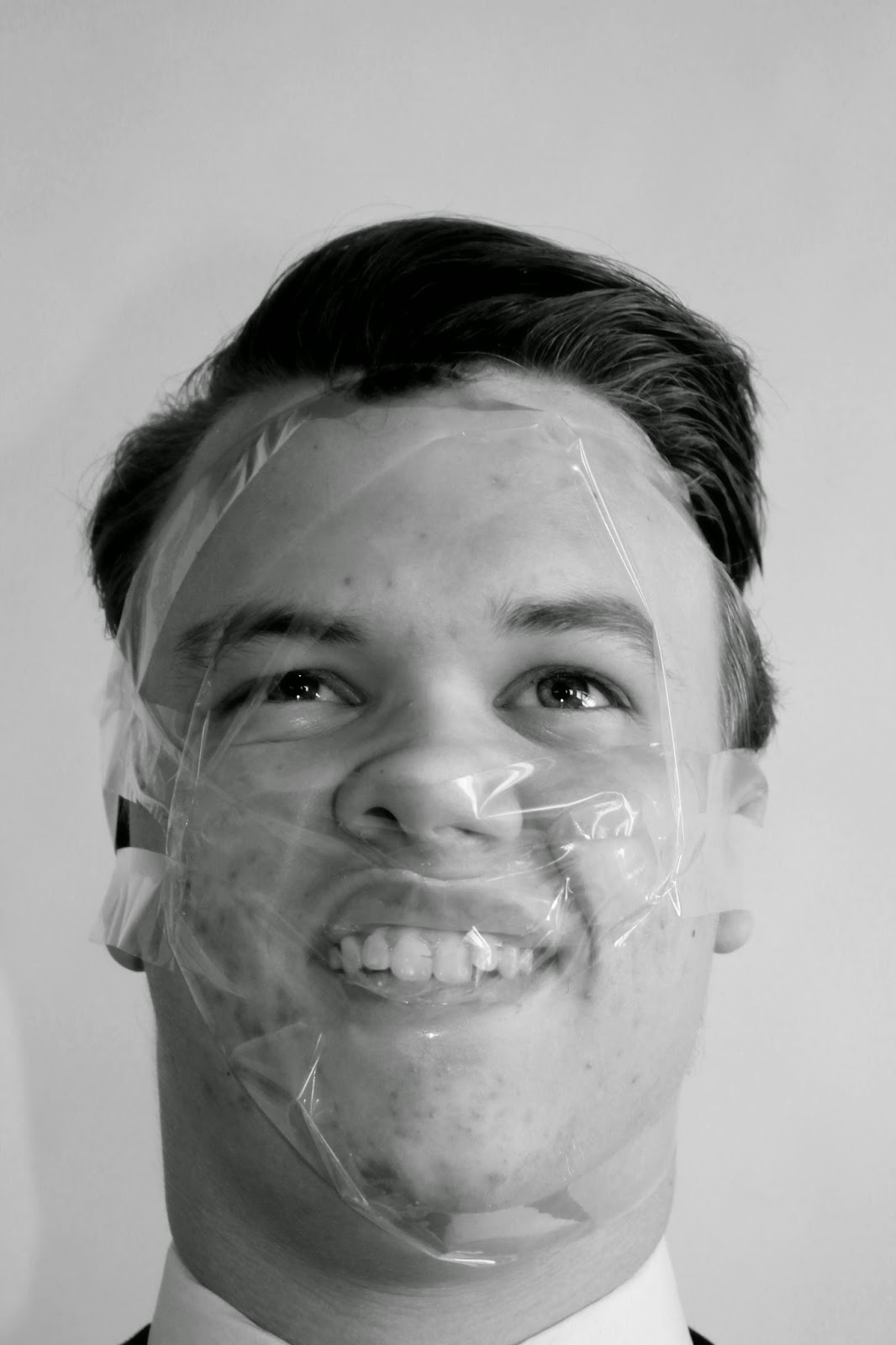 Before and After: In this edit I used the black and white tool to create a monochrome effect however when I did the whole image looked very plain lacking a variation of tones so in order to change this I used the levels tool pulling the black slider across in order to darken the left side of the image and the models face slightly. It is a very simple edit but in this case less is more and it makes the image overall look better with minimal editing. In the next edit once again I used black and white tool to
 experiment with the image being in monochrome rather than colour. I think black and white images are better sometimes and mainly for portraits as they make the image more flattering and they catch your eye more as shown in my first edit compared to the original image. Next I played around with the colour sliders, I decreased the reds which made the models face very dark, his blemishes stand out more, his eyes less human like and overall I think it looks more alienated. Finally I moved the yellow slider which made the image look more grainy helping to create a flawed an imperfect image compared to the first edit where I am trying to make it look more flattering and of perfection.
 Before and After: In this edit all I did was increase the contrast in order to make the faces look less pale and have more colour too them but also to
Friday, 10 April 2015
Shoot 4

Monday, 6 April 2015
Best Edit

This is my best edit for shoot 3, it is of a female model who has squashed her face up against a window in order to distort the facial features to make them flawed as this is not a representation of what typical beauty is or what you would see in magazines. This shows my artist influence of Jenny Saville as in her paintings she paints them as if her models are pushed against glass which in turn deforms them. I edited this image by decreasing the brightness to -10, then increasing the contrast by 10 to make the colours more bold and intense, I increased the vibrance by 20, increased the saturation on the tones of reds and greens and finally I decreased the blue to -100 which made the towel in the background appear more white as it did have a blue tint to it. There is only a subtle difference between this edited image and the original one as I feel it did not need much editing to try and make the model look more flawed but at the same time to help the image look more flawed which is helping it to look better and more perfect.
For my next shoot I plan to incorporate both my artists by doing a studio shoot of portraiture to show the influence of Annie Leibovitz but also by experimenting with a different type of material in order to create flaws in the face to show the influence of Jenny Saville. I will be doing this this by wrapping cello tape around peoples faces trying to move the facial features again like how the photographer Wes Nawman does in his images however Jenny Saville will still be my influence as I am just experimenting with a different way to achieve similar results to her work in order to develop my work.
Sunday, 5 April 2015
Edits

 Before and After: In this edit I increased the vibrance and saturation in order to make the colours more intense in the image. Then I increased the contrast to help make the colours bolder which they both helped to make the image stand out more. I was going to use this image as my best edit however this edit and my best edit are very similar and I feel that the light rays shining through on the image has ruined it too have it as my best edit.
 Before and After: In this edit increased the contrast to make the skin look worse and unappealing and increased the shades of skin colour in the image to make it look more red trying to represent more of a skin condition, then I decreased the brightness to -26 as the background was too overexposed. Overall I think the image looks over edited and very harsh but it is a good edit for what I am trying to do. In the next image I tried two different ways to make the image black and white, one was to use the black and white tool and the next was to decrease the saturation to -100 however I feel
 decreasing the satiation didn't capture the variety of tones as well so the image looks more plain. I could have played around with the levels to create the effect I wanted with the right balance of tones of white black and greys. In the final image I cropped it too see what effect the image had on the audience when it was very close up and in my opinion it has made the model look worse because it is right in your face and you don't have any kind of background to distract you from the models face as much.
Thursday, 2 April 2015
Shoot 3

Monday, 30 March 2015
Best Edit


Before and After
This is my best edit for shoot 2, it is of a male model who has pushed his face against a scanner while its being scanned to create the theme of flaws I am trying to show to contrast against perfection. The model has been made to look larger then he actually is due to glass, ugly and discoloured and I like this image as I feel it really shows my artist influence of Jenny Saville. I edited this image by increasing the contrast and then playing around with curves which has made the models hair look very thin and like straw compared to the original image where it looks soft and thick. It has also made the lips and face look a lot more red, in pain and blotchy which has made his lips look more plump too. You can also see blemishes and imperfections more on the face. The last thing I did to the image was crop it slightly from the left hand side so that you can't see the transparent paper underneath.
For my next shoot I plan to further my experimentation by using glass again but from somewhere different which will be the glass from my bedroom window and my classroom door in order to squash my models face up against to develop my work. This time I will be able to see how the model is morphing their face and I can give them guidance as to how I want it too look whereas I couldn't in the scanner.
Sunday, 29 March 2015
Edits

 In this image I played around with the tool hue and satiation tools in order to make the image look more 'cold'. I increased the hue by 36 and the saturation by 20 which helped make the image look more 'cold' and has also made the models hair green which could be considered a flaw. It has also made the skin appear more white and in distress from being squashed. What I like in this image is that it looks as if the model is underwater, which I think the editing has helped achieve this effect but also the transparent paper we put underneath the models face.
 In this edit I decreased the brightness to make the background look darker, then I increased the contrast to highlight the face more as it added more colour to the face. Compared to the original image it doesn't look I have decreased the brightness and increased the contrast and this is due to me then experimenting with the blacks, greys and whites using levels and from doing so I have managed to edit it so that you can see all the dirty fingerprint marks on the scanner from other people using it which has made the image flawed. In both images the model is using here hands to help aid in distorting the face.
 Thursday, 26 March 2015
Shoot 2

Monday, 23 March 2015
Photo Analysis
 |
| Title: Unkown Artist: Jenny Saville Date: 1995/1996 Oil on canvas |
 |
| Title: Fulcrum Artist: Jenny Saville Date: 1999 Oil on canvas |
perceive their bodies as they feel they are a lot bigger than they actually are but once again it has been exaggerated but Saville is trying to make expectation of what is perfect more appropriate compared to a skinny women. The image on the right is actually a painting of what I can see of 3 women squashed up against and laying on each other. The image on the right is a painting where the models face has been pushed up against glass, how the face is deformed and flawed as the models face would not look like this usually but due to the glass it has been altered. There are many different tones of colours in the paintings that have been layered and are overlapping with the marks of paintbrushes which have been dragged and twisted around in different motions on the canvas but the tones are bland and pastel coloured based. The actual paintings of the skin its-self is quite violent, harsh and bruised.
 |
| Title: Plan Artist: Jenny Saville Date: 1993 Oil on canvas |
This painting is a nude portrait of Saville herself and has
been intentionally made to look large, even with large breasts which have to be
held up in order to see the rest of the body. The lines drawn on her body
remind me of the marks surgeons make on you before you are about to
have liposuction done or the targets on during archery. It brings out the idea
that the the skin needs to be cut away because model is flawed where she is fat
and not perfect and skinnier, like a males or the media's typical
fantasy of the perfect body, which shows the artist concerns on the matter. I
also can see a sense of vulnerability as she is naked and using her arm to
cover herself however in contrast to this at the same time you can see the
strength and power in the painting being able to bare all.
Friday, 20 March 2015
Jenny Saville

How am I going to use Jenny Saville as an influence?
I am going to use Jenny Saville as an influence in my work to expand on the experimentation in my work but I will be focusing on creating flaws in the model by using props. Some images I looked at that have inspired me were Saville's paintings of larger nude women pushed up against glass. For my third shoot I plan too use members of my glass and getting them to push and mush up their faces against a glass scanner, to create a flaw as their faces aren't typically "perfection".
Wednesday, 11 March 2015
Best Edit
 Before and After: This is my best edit for shoot 1, it is of a female model who I am taking a simple portrait of which is how my influence of Annie Leibovitz is being shown. I have presented the image before I cropped it as well as it is easier to
 tell the big differences in the edited image from the original image between these two images rather than looking at the original and the cropped image. This best edit follows on from the step by step edits below. To get this final edit completely airbrushed it and I edited it by doing all the steps I outlined below, then I used the clone stamp tool in order to get rid of all the stray hairs and then I finally cropped the from the top and the sides slightly which as made the model look taller. I was trying to perfect the image and airbrush it like you would in beauty magazines.
For my next shoot I plan to leave the theme of perfection and my artist Annie Leibovitz and come back to her later. I plan to follow the theme of flaws and get members of my class to push their faces up against the scanner while it scans in order to flaw their facial features.
Tuesday, 10 March 2015
Edits
 You should look at these images in a zig zag pattern from left to right or if you click on the first image to make it larger you can view them as a slideshow. The image on my left is the original image and the images thereafter are a step by step presentation of how I edited the original image in order to get to my final/best edit. In the first edit I made the models teeth whiter and I did this through the same process as in my initial shots by using the lasso tool to select the area I wanted, then selecting yellows and decreasing the saturation to -100 to remove the yellow from the teeth leaving them whiter and using the lightness slider to brighten the teeth. However when I did this it brightened the area around them so I filled the layer mask with black and used the brush tool and painted over the teeth with white to bring the whitening and brightening back. I also set the opacity of the layer to 75% so the teeth looked more of a natural white rather than being over brightened and whitened. In the second edit I have made
it look as if the model is wearing lipstick as i

 added more colour too them. I did this by using the lasso tool to select the area of the lips I wanted and then I dragged the hue slider along till I got a nice pink shade I wanted that wasn't too overdone. In the third edit I have used the spot healing brush tool in order to remove all the blemishes, freckles and spots on the model and then I neatened up her eyebrows so they weren't as bushy. I did this by using the liquify tool and then using the forward warp tool with a brush size of 40, brush density of 20 and a
 brush pressure of 30 around the eyebrows to make them look longer and thinner. The movements were up-down at the top and down-up at the bottom. In my fourth edit I was focusing on making the models nose smaller and thinner so I used the liquify tool and used the forward warp tool again using a smaller brush size for the top of the nose and a larger brush size for the bottom, using movements going towards the nose. Then I used the pucker tool to make the smile lines look smaller and better. In this edit I also used the liquify tool and forward warp tool again in order to make the models face, head and body thinner and smaller using a large brush size of 300.
 Friday, 6 March 2015
Shoot 1

Tuesday, 3 March 2015
Portraiture Tips
I did some research online in order to gather some portraiture tips that would be useful before I start shooting portraiture photography. Here were the tips I found which I am going to try and follow in my own portraiture work:
- You need to know how to pose your subjects for portrait photography properly to shoot flattering images
- Your subject should always be relaxed to create a improved portrait
- Do not be afraid of movement
- For close up portraits focus on the eyes
- Softer images are better for portrait photography
- Experiment with subject expressions
- Fill the frame
- Think about your composition
- Experiment with lighting
- A wider aperture (small f number) is best for portraits which gives a shallow depth of field
- Use a tripod to reduce camera shake which could cause blur
- If you have one, use a nifty 50 lens
Saturday, 28 February 2015
Photo Analysis
 |
| Title: Meryl Streep Artist: Annie Leibovitz Date: 1981 |
 |
| Title: Leonardo Dicaprio Artist: Annie Leibovitz Date: 21st August 2010 |
 |
| Title: Cate Blanchett Artist: Annie Leibovitz Date: Unknown |
Friday, 27 February 2015
Annie Leibovitz

How am I going to use Annie Leibovitz as an influence?
I am going to use Annie as my influence simply for looking at portraiture and capturing the beauty in the image however my images are going to be more studio based focusing on just the model with nothing else in the background as if the image was going to be used in a magazine e.g. Vogue.
Wednesday, 25 February 2015
Thoughts..
Is my work viable?
I think that my work is viable however the current ideas I have are too narrow and do not allow me room to expand my ideas as it only focuses on the facial features and how they are flaws but can be turned into beauty but how they are also beauty within themselves. I have decided I am only going to stick to two themes that contrast each other with are flaws and perfection and use my shoots to show the contrast between them. I need to expand on my main idea and first of all I am going to do this by showing how you can manipulate the body and face in order to make it flawed by using resources and objects. For my first shoot I plan to take some images similar to my initial shots of portraiture but this time I will shoot them in a studio using either a black or white backdrop still focusing on the models face and facial features so I can edit them later on to create perfection.
I think that my work is viable however the current ideas I have are too narrow and do not allow me room to expand my ideas as it only focuses on the facial features and how they are flaws but can be turned into beauty but how they are also beauty within themselves. I have decided I am only going to stick to two themes that contrast each other with are flaws and perfection and use my shoots to show the contrast between them. I need to expand on my main idea and first of all I am going to do this by showing how you can manipulate the body and face in order to make it flawed by using resources and objects. For my first shoot I plan to take some images similar to my initial shots of portraiture but this time I will shoot them in a studio using either a black or white backdrop still focusing on the models face and facial features so I can edit them later on to create perfection.
Monday, 23 February 2015
Edits
Using the the photo editing tool Photoshop, I was able to edit some of my initial shots to form these edits. In order to create the vision of perfection in beauty, I played around with some of the different tools in Photoshop to create different effects to change the models facial features. Here are some of my edits below:

 As you can see from these images I have whitened the models teeth and it has made a big difference as teeth whitening can brighten your teeth and give you more confidence.

It makes the model look as if she is proud to show off her smile as her teeth are more perfect. In order to whiten the teeth I selected the area around the teeth with the lasso tool, chose a hue/saturation adjustment layer and selected yellows from the edit list. Then I decreased the saturation to -100 to remove the yellow from the teeth leaving them whiter. Next I selected master from the edit list and dragged the lightness slider to +25 to brighten the teeth however doing this not only brightened her teeth but also the area around them as this is what I initially selected with my lasso tool. In order to fix this I filled the hue/saturation layer mask with black which makes it look like I have undone all my work (which it hasn't). Finally I selected the brush tool, set white as my foreground colour and painted with white over the teeth to bring the whitening and brightening back.
 I decided not to do too much editing on the images so I could focus on completely editing them for my first shoot. In this image in order to re-touch the whole face and get rid of any spots, freckles and blemishes which are considered imperfections I used the spot healing brush from the toolbox. I set the brush so that is was a small size and used navigator to zoom into the models face so I could really see all the imperfections close up and get rid of them to make the image more perfect.
As you can see from these images I have whitened the models teeth and it has made a big difference as teeth whitening can brighten your teeth and give you more confidence.It makes the model look as if she is proud to show off her smile as her teeth are more perfect. In order to whiten the teeth I selected the area around the teeth with the lasso tool, chose a hue/saturation adjustment layer and selected yellows from the edit list. Then I decreased the saturation to -100 to remove the yellow from the teeth leaving them whiter. Next I selected master from the edit list and dragged the lightness slider to +25 to brighten the teeth however doing this not only brightened her teeth but also the area around them as this is what I initially selected with my lasso tool. In order to fix this I filled the hue/saturation layer mask with black which makes it look like I have undone all my work (which it hasn't). Finally I selected the brush tool, set white as my foreground colour and painted with white over the teeth to bring the whitening and brightening back.
Friday, 20 February 2015
Initial Shots
To kick start my photo taking I took some initial shots in order to experiment with portraiture and to see if I liked working with/was any good at portraiture. It was also to see if I thought the idea of incorporating the themes flaws, ideals and perfection would work for me or not in my images. For them, I took a couple of images of my friend focusing on her face and facial features.

 I shot these images in portrait mode using a large aperture which is best for portrait shots. I think the lighting in the image is at the correct exposure and highlights the models face nicely. In order to make these shots better I should have made sure I used a clear backdrop so that the background isn't distracting to the audience so that they focus more on the model however I could crop the images to take out any distractions. The images can be considered as perfection due to natural beauty but also flawed due to the bushier eyebrows, darkness under and around the eyes and lines on the face which is not seen as perfect which can all be neatened up and edited in Photoshop to create the typical version of what perfection is in beauty that is portrayed in magazines in our modern days.
I shot these images in portrait mode using a large aperture which is best for portrait shots. I think the lighting in the image is at the correct exposure and highlights the models face nicely. In order to make these shots better I should have made sure I used a clear backdrop so that the background isn't distracting to the audience so that they focus more on the model however I could crop the images to take out any distractions. The images can be considered as perfection due to natural beauty but also flawed due to the bushier eyebrows, darkness under and around the eyes and lines on the face which is not seen as perfect which can all be neatened up and edited in Photoshop to create the typical version of what perfection is in beauty that is portrayed in magazines in our modern days.
Subscribe to:
Posts (Atom)