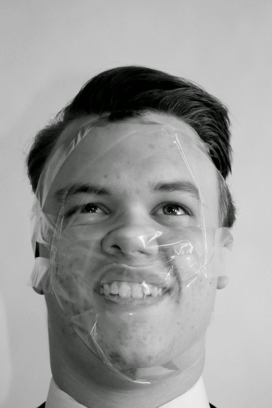
 Before and After: In this edit I used the black and white tool to create a monochrome effect however when I did the whole image looked very plain lacking a variation of tones so in order to change this I used the levels tool pulling the black slider across in order to darken the left side of the image and the models face slightly. It is a very simple edit but in this case less is more and it makes the image overall look better with minimal editing. In the next edit once again I used black and white tool to
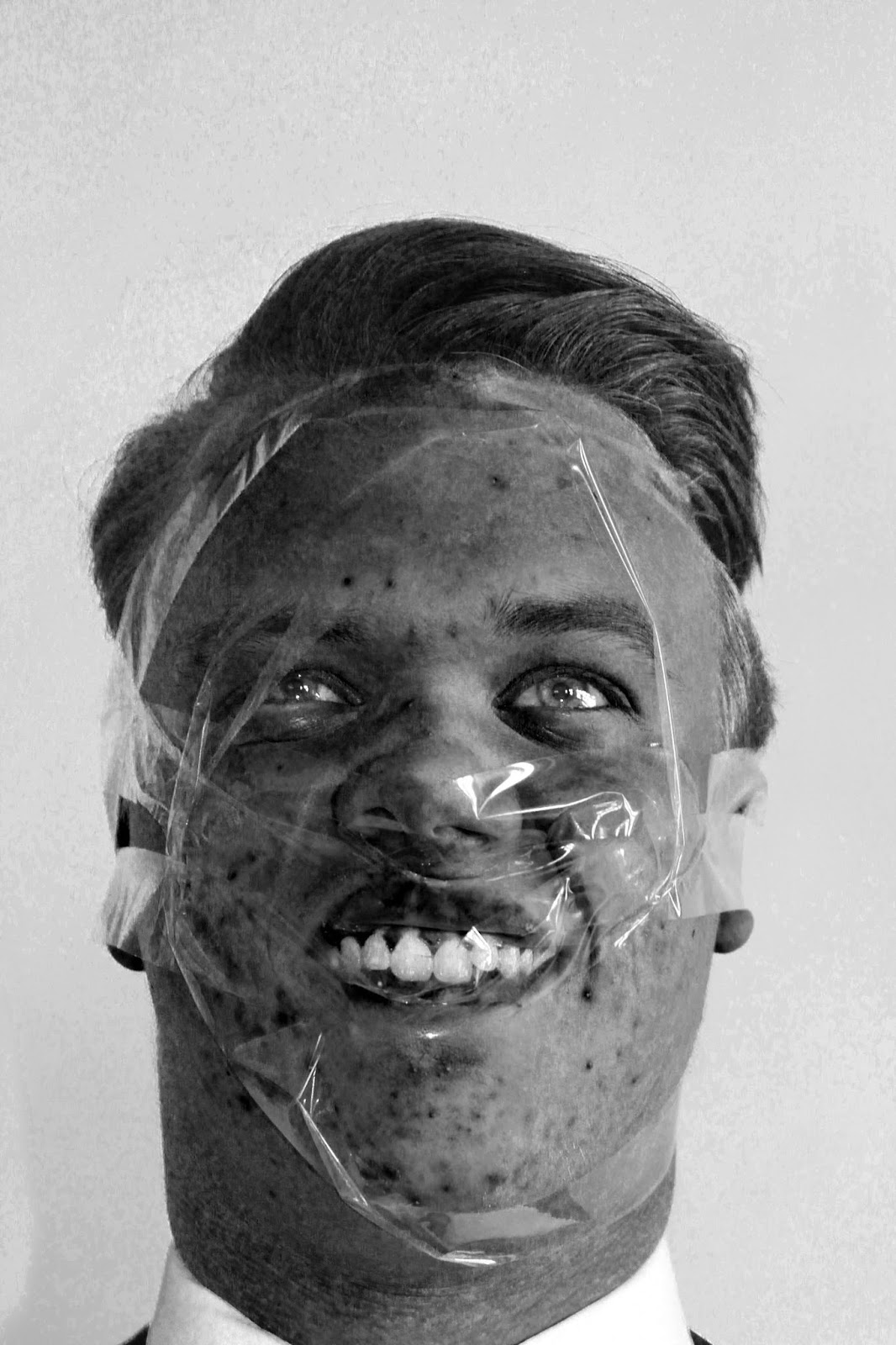
 experiment with the image being in monochrome rather than colour. I think black and white images are better sometimes and mainly for portraits as they make the image more flattering and they catch your eye more as shown in my first edit compared to the original image. Next I played around with the colour sliders, I decreased the reds which made the models face very dark, his blemishes stand out more, his eyes less human like and overall I think it looks more alienated. Finally I moved the yellow slider which made the image look more grainy helping to create a flawed an imperfect image compared to the first edit where I am trying to make it look more flattering and of perfection.
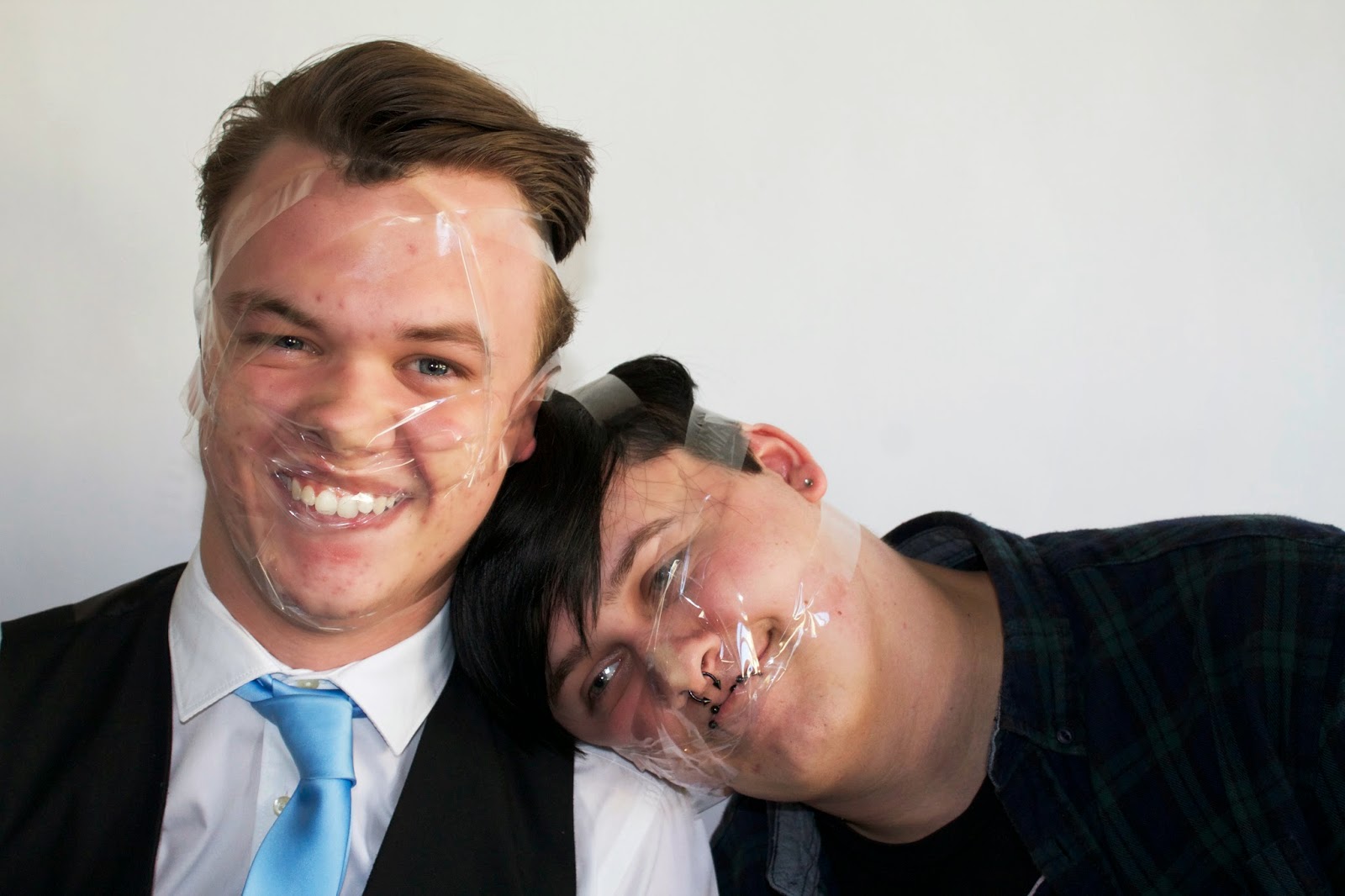
 Before and After: In this edit all I did was increase the contrast in order to make the faces look less pale and have more colour too them but also to
make the clothes and hair have a higher intensity of colour to them. In the next edit I made the image black and white and then used the levels tool to move the grey and white sliders to achieve the tones I wanted. There were a few more images I did which I have chosen not to include as they were all pretty much the same but I couldn't get the effect I wanted so they weren't very good edits. One I chose not to include I felt the models shirt was too dark as you couldn't see the pattern on it, so in this edit I made it lighter so you could see it. In this edit originally I did think the background was too overexposed however I have now decided I should have included this as my best edit as my actual best edit printed out a lot darker than it looks on a computer so I think printing this edit off would achieve the image I want when printed off.


No comments:
Post a Comment